More about my art
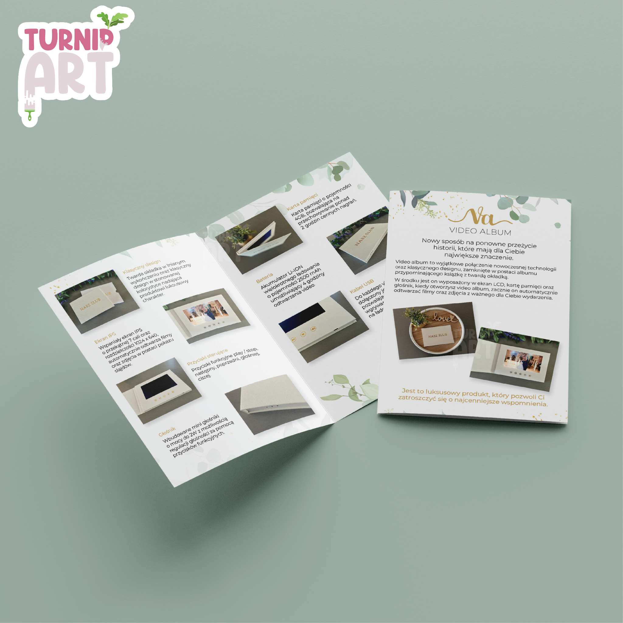
Video Album
The flyer and logo were designed for the client “Video Album.” The project was developed in line with the client’s vision and tailored to match the brand’s overall style and values. The flyer presents the company’s main product - wedding video albums created as lasting keepsakes from weddings and ceremonies.
A refined palette of white and gold, complemented by subtle floral elements, was chosen to reflect the elegance and emotional character associated with wedding celebrations. The layout was designed to be clear and inviting, highlighting the product while maintaining a sophisticated, timeless aesthetic.
The logo is an improved and refreshed version of the previous design. It was simplified to a minimalist form that clearly presents the company name, ensuring better readability, versatility, and consistency across branding materials.
Turnip Art
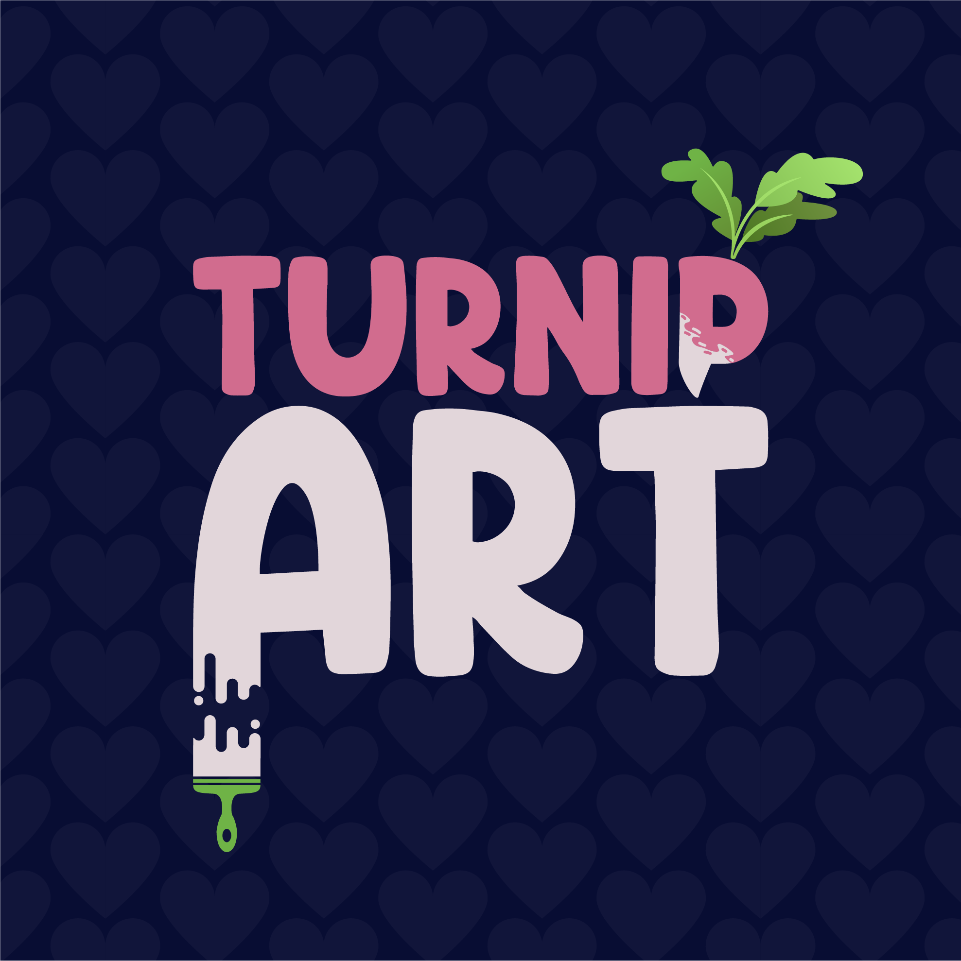
Turnip Art is the logo of my personal brand.
The color palette is inspired by the turnip itself, combined with a deep navy background to create strong contrast and visual balance.
The brushstroke forming the letter A highlights the artistic side of my work, while the leaves integrated into the letter P reference the turnip - my personal symbol and visual signature. Through these details, the logo combines personal identity with artistic expression.
The overall design was meant to reflect who I am and what my brand represents.
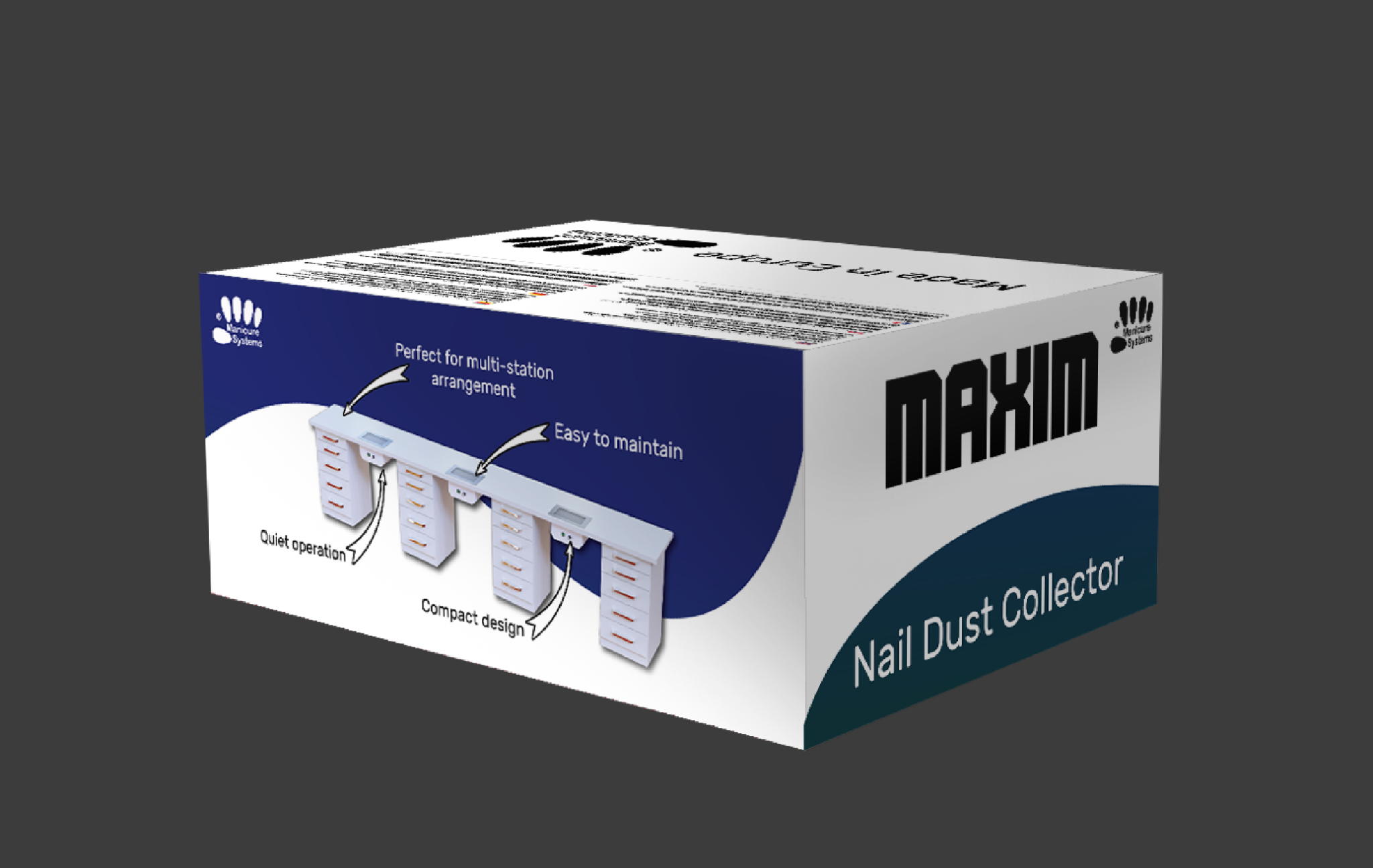
Manicure Systems
This was my first commissioned project for a company producing desk filters for manicure workstations. The objective was to clearly present the product, its name, and all required markings and product descriptions, while ensuring clarity and compliance with industry standards.
The design process involved close collaboration with the client, allowing the project to be refined according to their vision and expectations. A calm, clean color palette was chosen to communicate professionalism, precision, and hygiene - key qualities associated with beauty and manicure work environments.
The final design balances functionality with visual clarity, ensuring the product information is easy to understand while maintaining a modern and professional appearance suitable for commercial use.
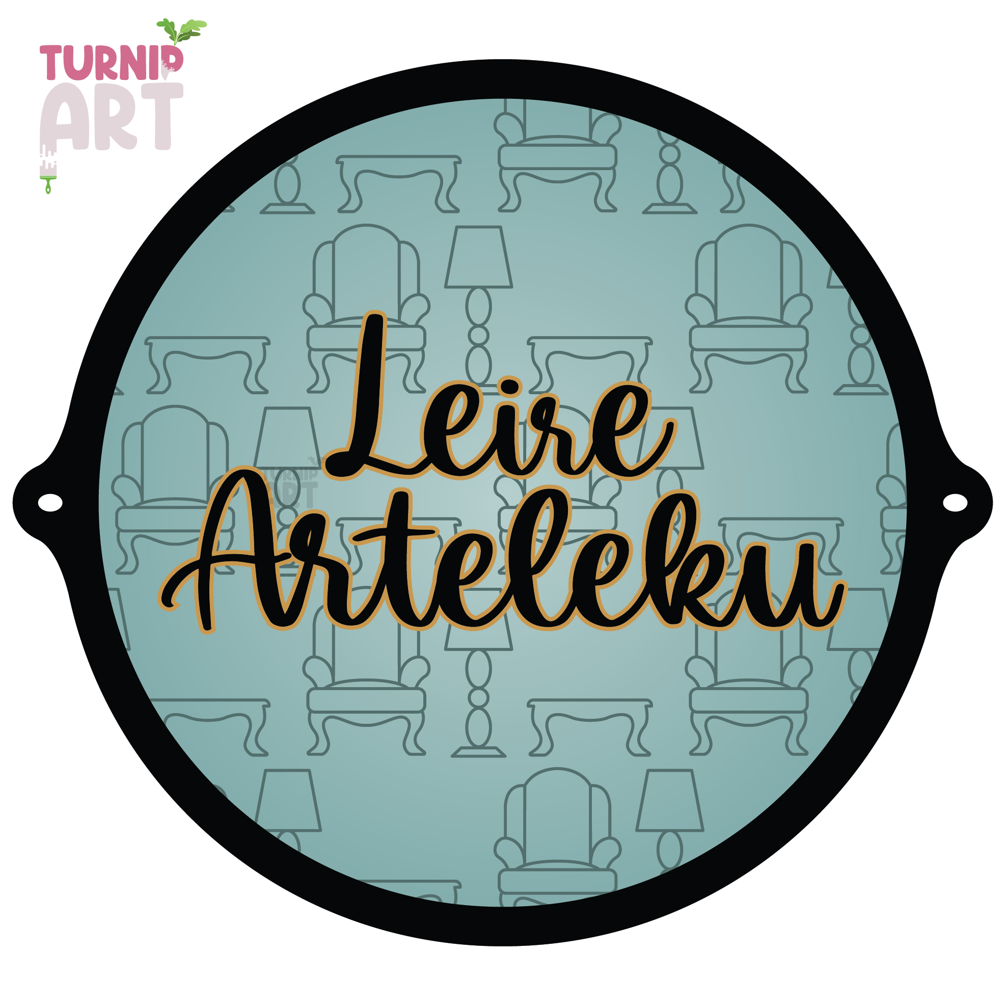
Lerie Arteleku
This project involved designing a logo and banner for a female entrepreneur specializing in restoring vintage furniture. The client had a clear vision for the brand identity, and after exploring many options together, she chose the final design that best represented her style and business.
The chosen color scheme features a muted bluish-green background complemented by gold and black accents, creating an elegant and timeless look. Furniture outlines integrated into the design subtly communicate the nature of her craft while maintaining a minimalist aesthetic.
In addition to the logo and banner - which was designed to hang prominently above her workshop - I created matching elements such as a price chart, business hours, and contact information. All materials were carefully crafted to maintain a cohesive visual identity.
The final result perfectly matched the client’s vision, blending her ideas with my craftsmanship to deliver a distinctive and professional brand presence.
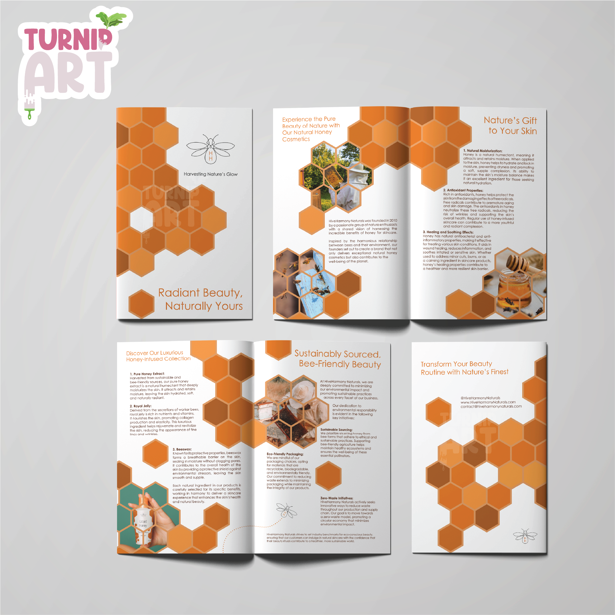
Flyer Honey cosmetics
For the conceptual brand Honey Cosmetics, I aimed to create a distinctive and cohesive visual identity that stood out as a creative challenge. I wanted to design a simple yet elegant bottle concept to showcase alongside the flyer, demonstrating versatility and product-focused design skills.
The main design challenge was incorporating a honeycomb pattern that reflects the natural, sweet essence of the brand while maintaining a clean and modern aesthetic. I developed the logo, product label, and brochure, ensuring all elements aligned with the brand’s theme and created a harmonious visual experience.
This project allowed me to explore packaging design, branding, and print collateral, resulting in a polished and versatile presentation that highlights both creativity and attention to detail.
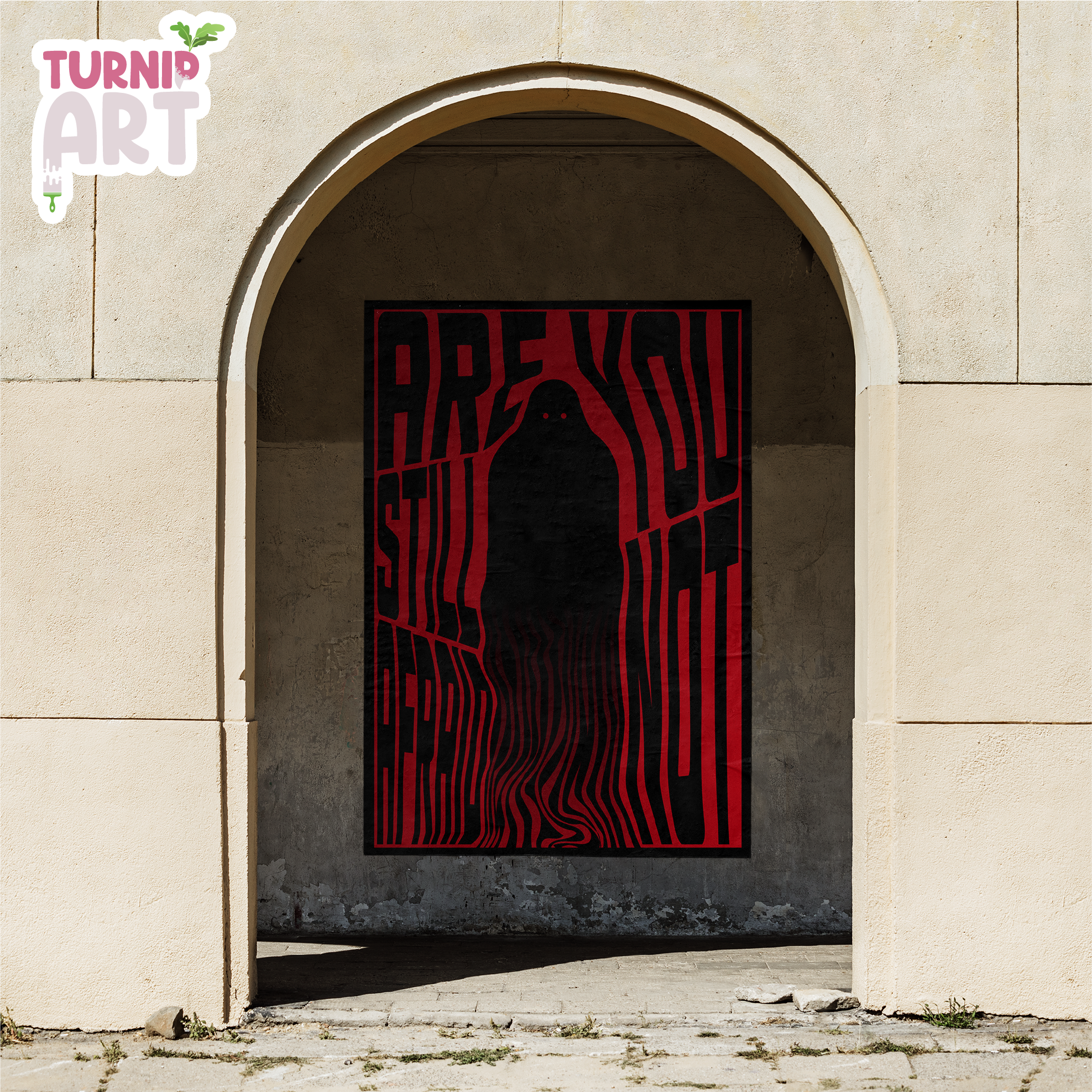
Poster "Are you still not afraid?"
The poster “Are You Still Not Afraid?”. The concept consisted of a single figure with irregular, flowing lines emerging from its form.
While developing the illustration in Adobe Illustrator, I followed the visual flow and intuition inspired by the character itself. Through irregular lines and a dark, expressive figure, my aim was to create a composition that draws attention and encourages the viewer to pause.
Additionally, when the poster is viewed in a frame, the dark silhouette subtly reflects the viewer’s own image. This effect invites self-reflection - questioning whether we ourselves might be the monster we fear, and whether our actions are truly as good as we believe them to be.
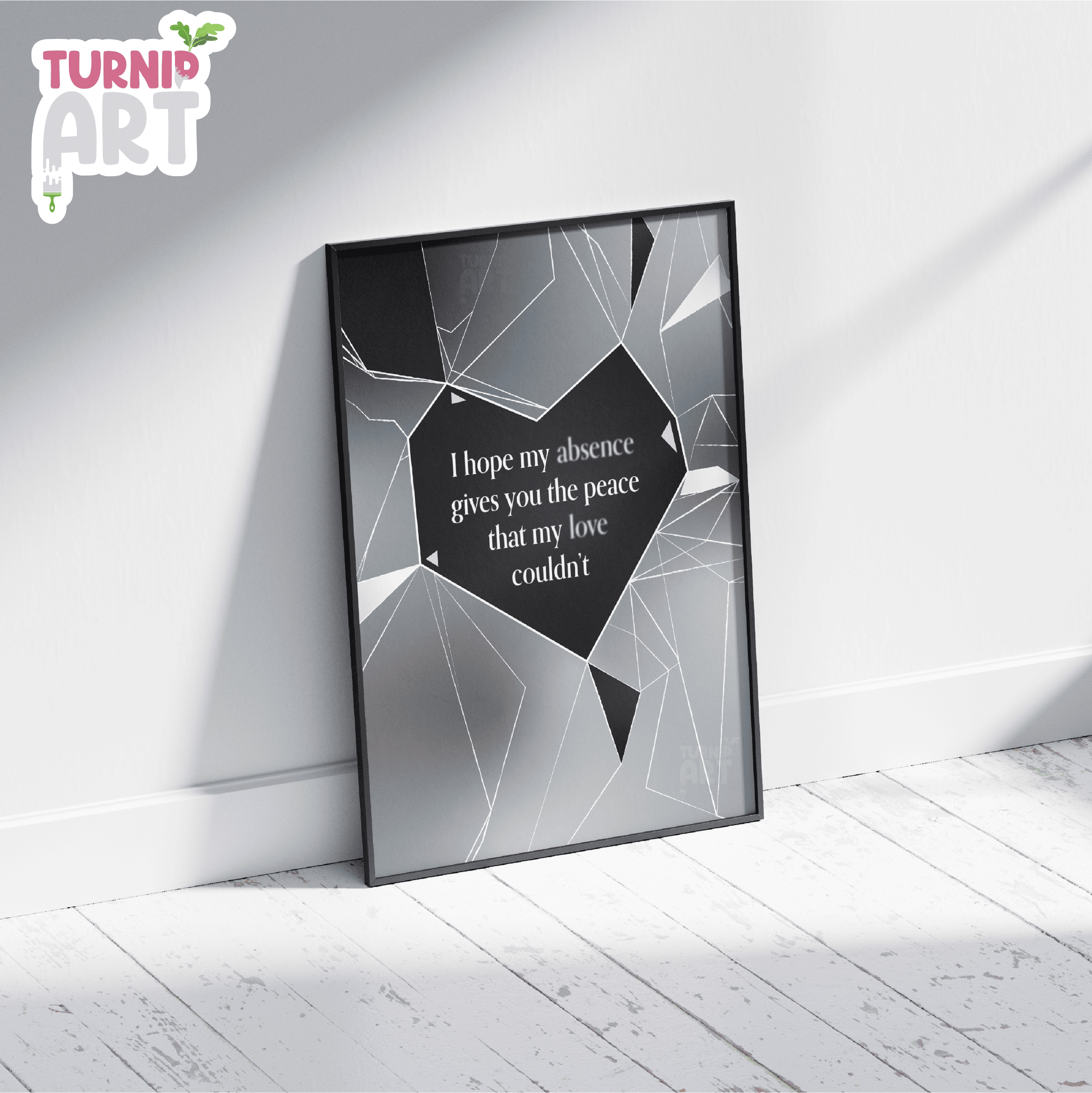
Poster "I hope my absence..."
The poster “I Hope My Absence” was created under the influence of strong emotions. I drew inspiration from many different artworks but couldn’t find one that perfectly captured my vision. So, I combined various concepts into a single composition — one that expresses the feelings of someone broken and resigned.
The piece conveys a hope that, perhaps, the absence will finally be felt, and the other person will be truly missed. The shattered glass symbolizes this emotional fragmentation and resignation, reflecting the inner state of the subject.
Beyond the visual elements, the poster is meant to evoke empathy and provoke reflection on the impact our presence — or absence — can have on others. It captures the fragile boundary between connection and loss, inviting viewers to consider what it means to be truly missed.
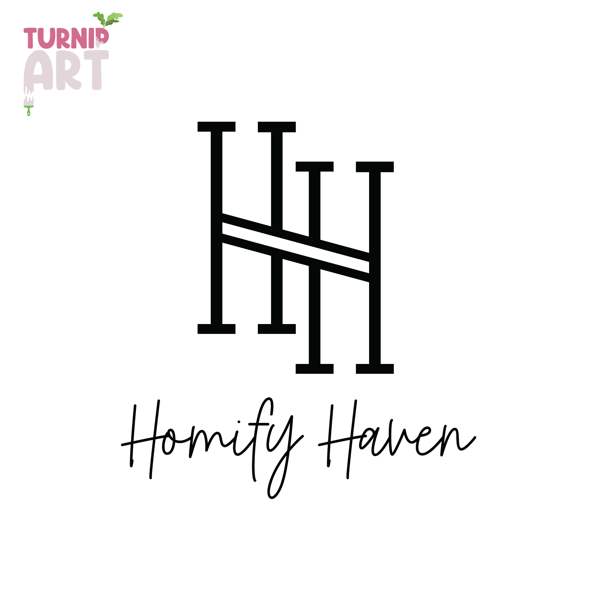
Logo Homify Haven
For this project, I designed a simple yet elegant logo for a fictional high-end home products brand called Homify Haven. The goal was to create a clean and classy visual identity that conveys luxury, comfort, and attention to detail.
The logo features two connected letter H’s, symbolizing closeness and a strong bond between the brand and its customers. This connection also represents the meticulous craftsmanship and care put into every product. Using only black and white, the design maintains a timeless, sophisticated look that can easily adapt across various branding materials.
The word Haven evokes a sense of sanctuary and luxury - suggesting that shopping with this brand feels like stepping into a personal heaven of quality and style.
To complement the logo, I created business cards and usage mockups to showcase the brand’s potential application in real-world settings, emphasizing simplicity and elegance.
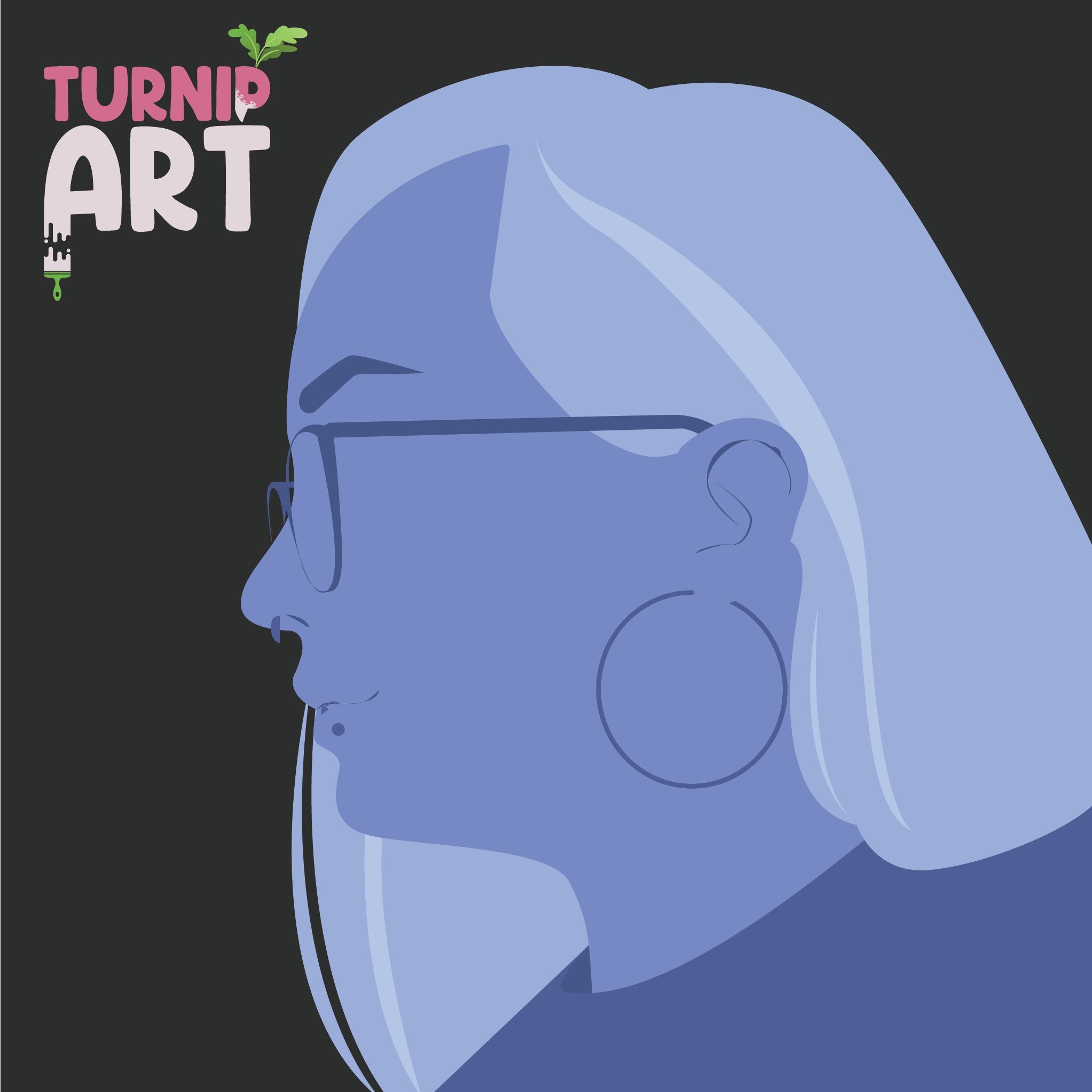
Vector Icons
This ongoing series explores creating minimalist side-profile vector portraits inspired by icons from the game Overwatch. The challenge was to capture each individual’s unique personality and distinguishing features using a limited color palette - strictly five hues per avatar.
By focusing on a tight range of colors, I simplify the forms while emphasizing key marks and traits that make each face recognizable. The result is a collection of stylized yet distinct portraits that balance simplicity with character.
This project pushes my skills in color theory, vector illustration, and portrait abstraction, and I plan to continue expanding the series with new characters and color schemes.
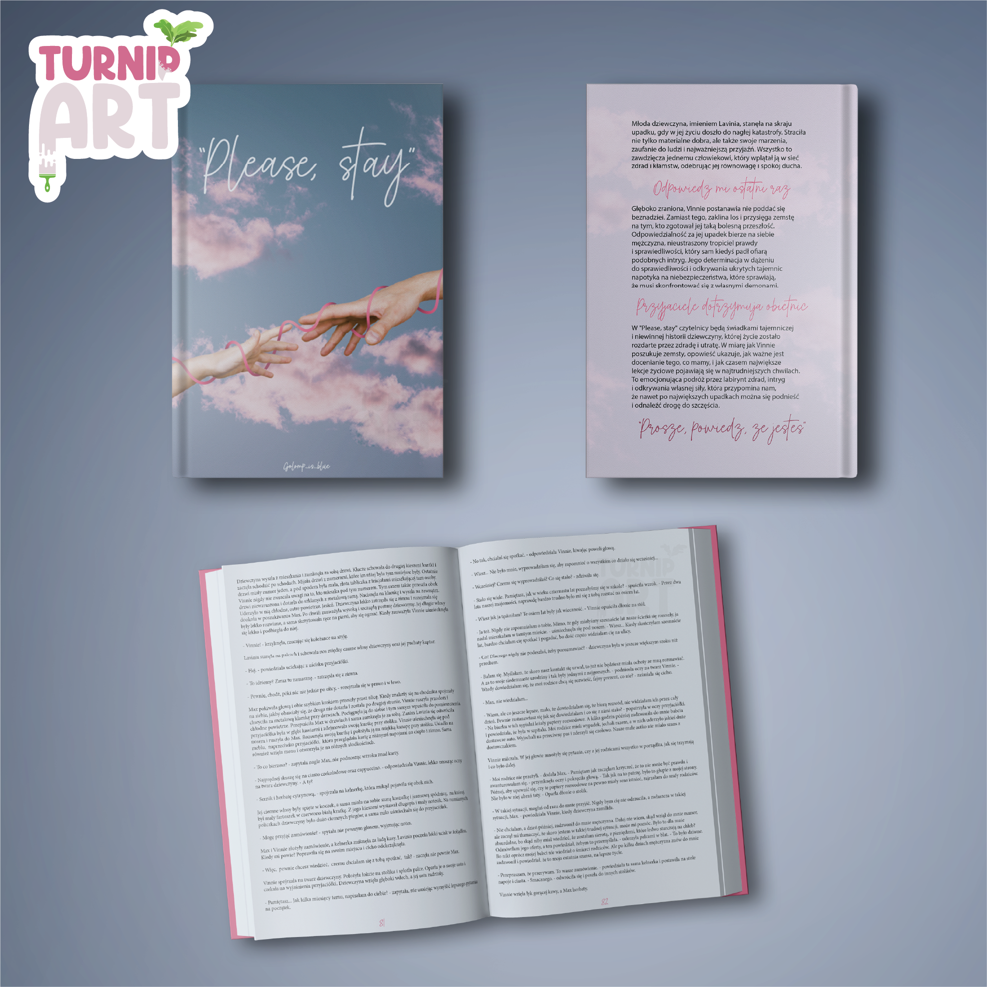
Book Cover "Please Stay"
The book cover “Please Stay” was designed as part of a conceptual book series. The visual style is soft and fluid, built around light blue and pastel pink tones to create a gentle, emotional atmosphere.
The hands featured on the front cover are directly connected to the story of the book, serving as a symbolic element rather than pure decoration. I intentionally kept the design minimal, with flowing forms, pastel colors, and limited additional elements, allowing the illustration and mood to take focus.
The back cover was designed with content-driven simplicity, using a clean font alongside a handwritten typeface - the same one used for the title - to maintain visual consistency. The emphasis was placed on the front cover, making it the primary focal point of the design.
The project was created in Adobe InDesign with additional work in Adobe Photoshop, combining layout precision with expressive visual elements.
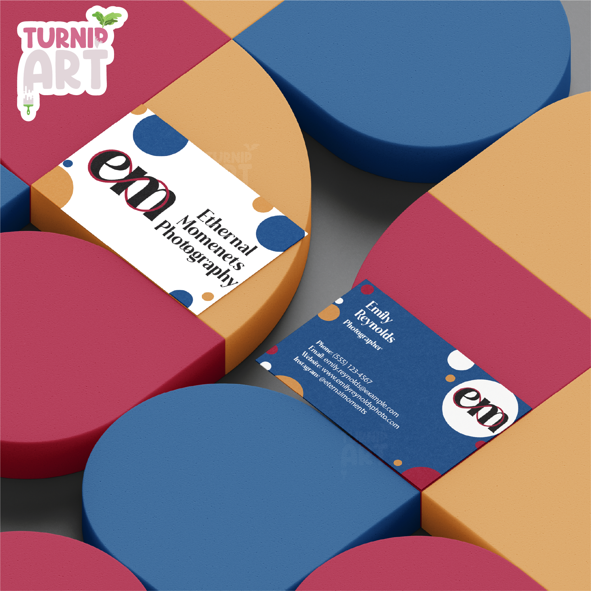
Business card "Ethernal Moments"
aThe business card design for the conceptual brand Eternal Moments was created for a photographer. The goal was to develop a simple yet colorful design that reflects the creative possibilities within photography.
The concept is built around small, colorful dots symbolizing pixels - individual elements that may seem insignificant on their own, yet come together to create something meaningful, unique, and complete. This idea mirrors the photographer’s work, where small details are captured to form powerful visual stories.
The name Eternal Moments reflects the essence of photography itself. Through photographs, moments can be preserved indefinitely, allowing memories to remain vivid and lasting over time. The final design balances simplicity with color and concept, creating a professional yet expressive visual identity.
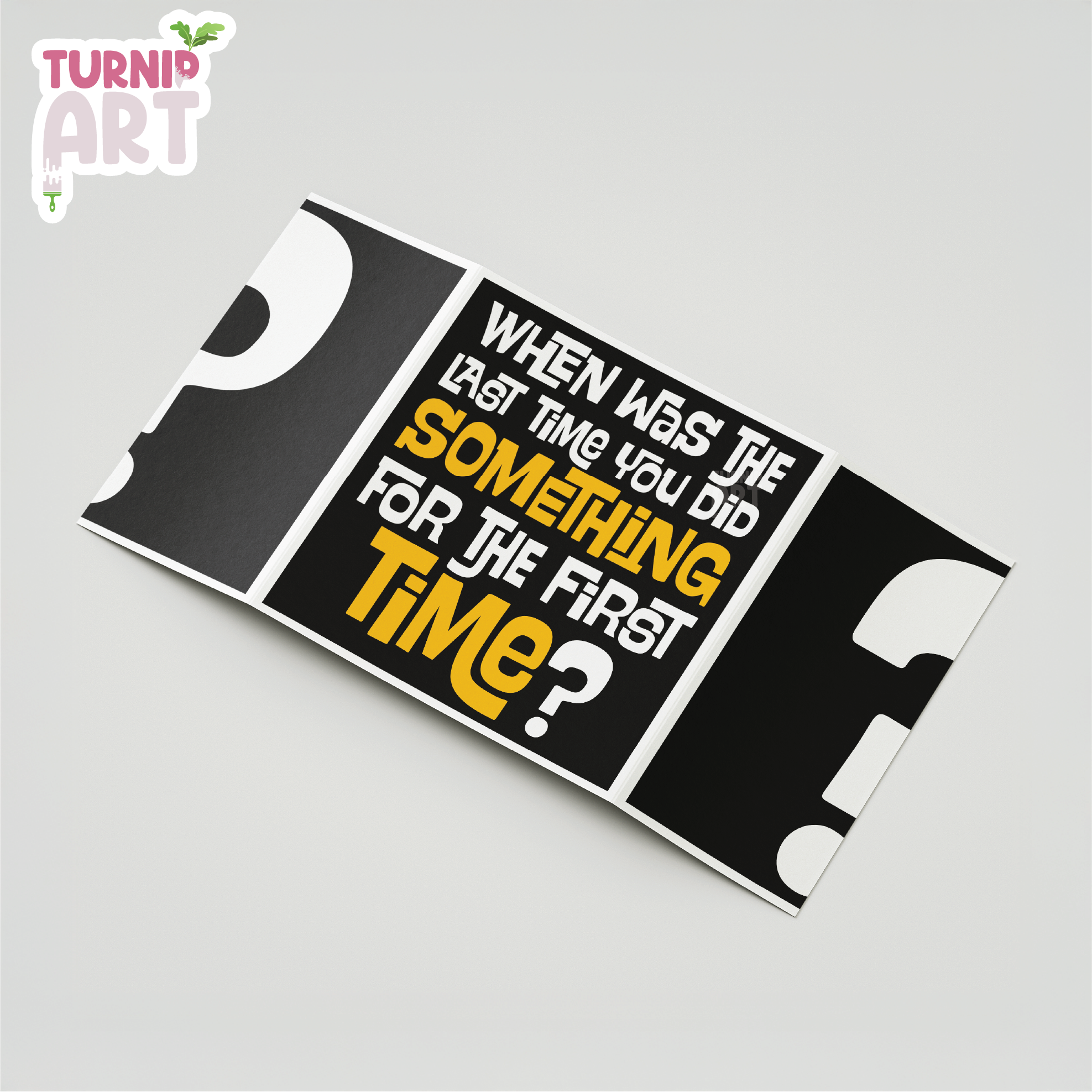
Flyer "When was the last time?"
This flyer was designed around the inspiring question: “When was the last time you did something for the first time?” and created in Adobe Illustrator. The goal was to experiment with a more chaotic yet still readable layout that visually reflects uncertainty and curiosity.
The color palette is limited to black, white, and grey, with yellow used as a complementary accent to highlight key words and the most important parts of the message. This contrast helps guide the viewer’s attention while maintaining visual clarity.
The flyer invites the viewer to answer the question on the back, emphasizing the importance of trying new experiences and stepping outside of comfort zones. The prominent question mark on the front represents the unknown - the unpredictability that comes with doing something for the first time and not knowing what might happen next.